
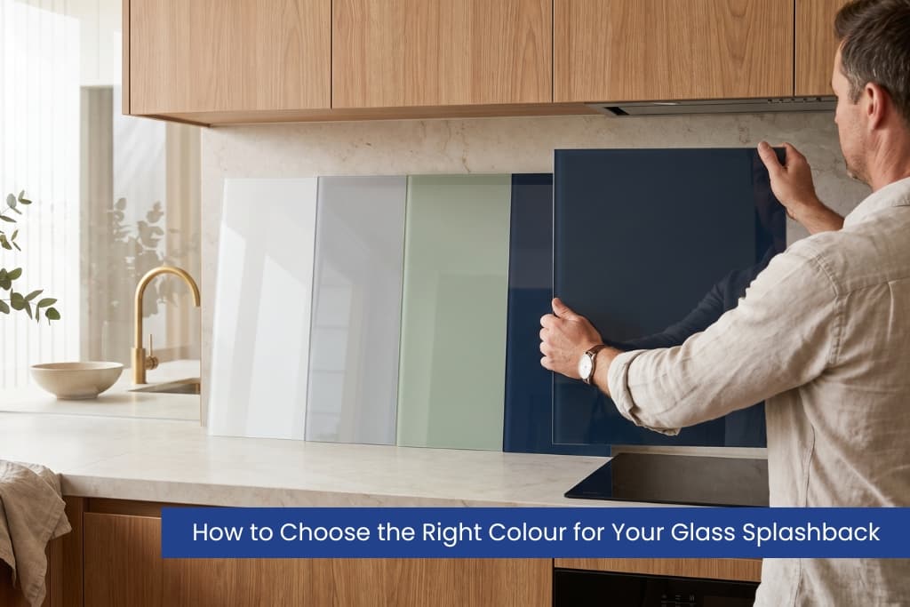
How do you choose the right colour for your glass splashback?
To choose the right glass splashback colour, start with the finishes you can’t change: your benchtop, cabinets, flooring and lighting. Match the undertone (warm or cool), decide whether you want the splashback to blend in or be a feature, then test a large sample in your own light before you order. Neutrals like white and grey date slowly; bold colours add personality but need more planning.
Key takeaways
- Let your fixed finishes (benchtop, cabinets, floor) lead the colour choice.
- Match undertone temperature: keep warm with warm and cool with cool.
- Decide the splashback’s job first: blend into the background or be a feature.
- Glass is reflective, so always test a large sample in your actual light.
- Neutrals suit resale; bold colours suit a home you plan to keep for years.
- Behind a cooktop, use 6mm toughened (Grade A safety) glass to meet Australian rules.
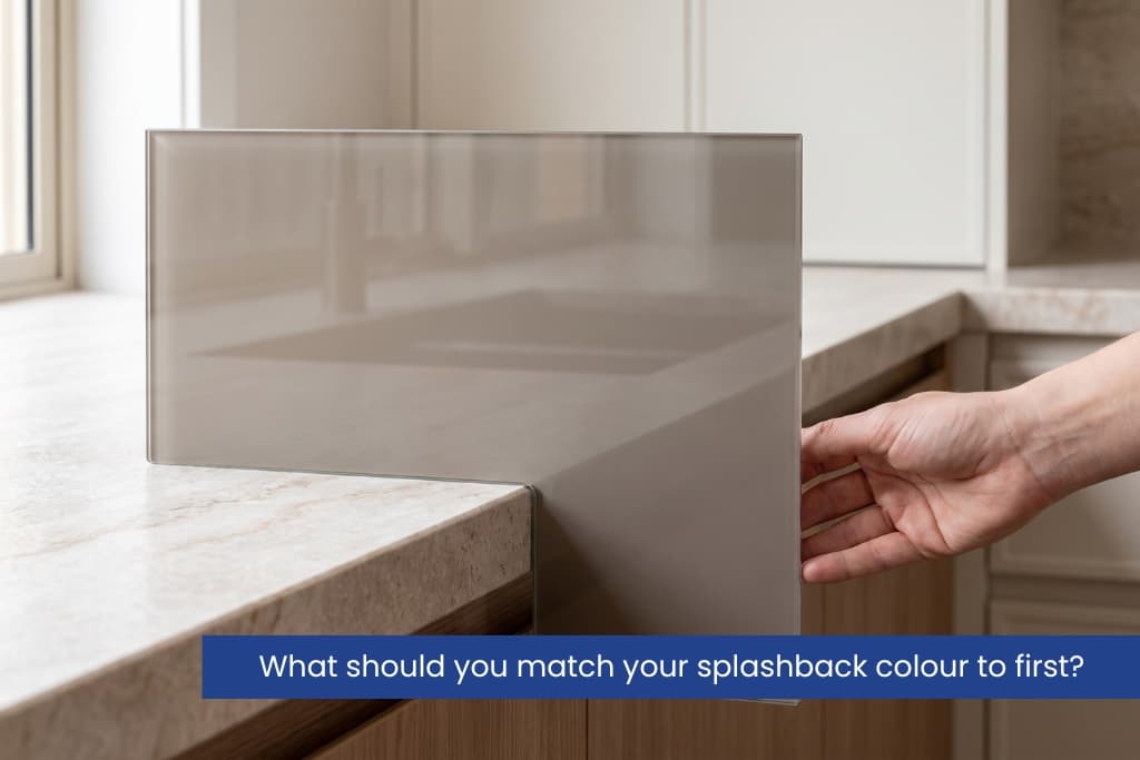
What should you match your splashback colour to first?
Match your splashback to the finishes you can’t easily change: the benchtop, cabinets and floor before you look at colour charts.
Hold a glass sample against your benchtop first and look at the undertone. Undertone is the subtle warm or cool bias under a colour; for example, a “white” that leans slightly cream (warm) or slightly blue (cool). A surface reads either warm (cream, beige, gold, timber) or cool (grey, blue, crisp white), and your splashback should sit in the same family, or it will feel slightly off even when you can’t say why.
Pattern matters too. A busy stone benchtop with heavy veining calls for a plain, solid splashback so the room stays calm. A plain benchtop leaves room for a stronger colour or a metallic finish. White or timber cabinets suit almost any colour, while dark cabinets usually look best with a lighter, reflective splashback behind them. If you’re still weighing up materials, our guide to custom coloured glass splashbacks covers the options, and Design Inferno can colour-match to your exact scheme.
Should a splashback blend in or stand out?
A splashback should either blend quietly into the background or act as one clear feature; decide which job it has before you choose a colour.
When blending works best
Choose a blended, neutral splashback when the room already has a strong feature: patterned tiles, a coloured island or a bold benchtop. White, off-white, light grey and greige quietly reflect light and make small rooms feel bigger. These colours also have the widest appeal if you plan to sell.
When a feature colour works best
Choose a feature splashback when the rest of the room is neutral, and you want a lift. Deep blue, forest green, charcoal, blush and metallic finishes turn a plain space into a talking point. Keep the bold colour to one zone — behind the cooktop or sink usually has the most impact so the room stays balanced.
Which splashback colours suit which spaces?
Neutral colours suit small rooms and resale, while deep or metallic colours suit larger, well-lit rooms that want a feature.
| Splashback colour | Mood it creates | Best suited to |
|---|---|---|
| White / off-white | Clean, bright, timeless | Small rooms, resale, minimalist styles |
| Light grey / greige | Calm, modern, neutral | Busy benchtops, open-plan spaces |
| Soft sage or olive green | Warm, natural, welcoming | Timber cabinets, Hamptons and country styles |
| Deep blue / navy | Rich, confident, coastal | Neutral rooms wanting a feature |
| Charcoal/black | Dramatic, sleek | Large, well-lit modern kitchens |
| Blush / soft pink | Soft, contemporary | Neutral cabinetry, feature walls |
| Metallic / mirror | Reflective, luxe | Compact spaces needing more light |
| Clear glass over paint | Fully custom | Colour-matching to an exact brand or paint |
Does the room change which colour you should pick?
Yes, the same colour behaves differently in a kitchen, bathroom or laundry depending on light and how the splashback sits against other surfaces.
In a kitchen, the splashback sits between the benchtop and overhead cabinets, so it competes with the busiest part of the room; match or gently contrast the benchtop. In a bathroom or ensuite, splashbacks behind vanities usually look best light and reflective to keep a small, humid space feeling fresh a tone you can echo in matching glass shower screens and wall mirrors. In a laundry, a hard-wearing feature colour can lift an otherwise plain room. Wherever it goes, glass is wipe-clean and grout-free, which is why a single bold colour reads so well over a large area.
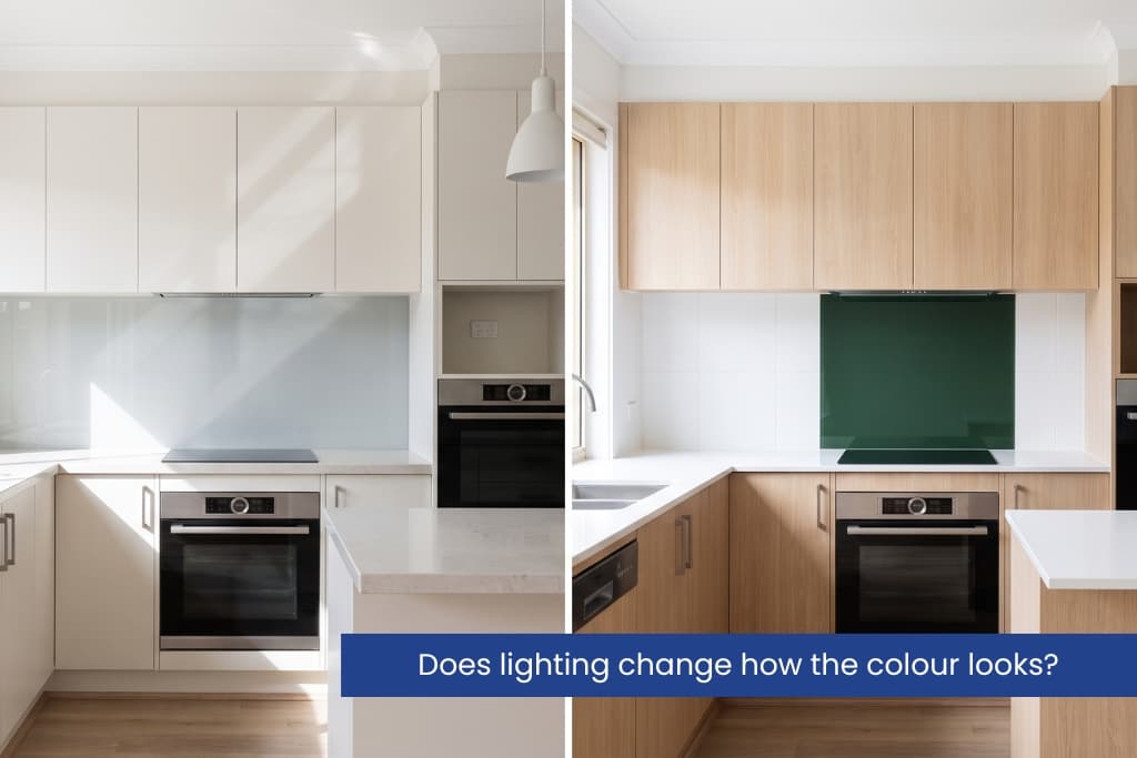
Does lighting change how the colour looks?
Yes, lighting changes a splashback colour more than most people expect, because glass is reflective and picks up the colour of the light hitting it.
Lighting is measured in Kelvin (K), a scale for how warm or cool a light looks. Warm white LEDs (around 3000K) make colours look cosier and slightly yellow. Cool white LEDs (around 4000K and above) look crisper and can add a blue tinge. Most kitchen lighting sits between 3000K and 4000K. Natural light shows a colour most accurately, so check samples near the window. In the morning and afternoon, north-facing rooms get warmer light, south-facing rooms get cooler, flatter light. If the space is dark, a lighter or metallic splashback bounces light around and lifts the whole room.
Gloss or matte finish which suits your colour?
Choose gloss when you want brightness and depth, and low-sheen (matte) when you want a calm look with easier day-to-day cleaning.
Gloss glass is the most reflective. It makes colours look deeper and bounces the most light, which suits small or dark rooms, but it shows fingerprints and smudges more easily. Low-sheen or matte glass hides marks better and gives a softer, contemporary look, but reflects less light, so pale colours can look flatter.
Safety note: Behind a cooktop, Australian rules require toughened Grade A safety glass. Under the National Construction Code 2022 and AS 1288:2021, that generally means 6mm toughened glass complying with AS/NZS 2208; a toughened pane is heat-treated to be far stronger than ordinary glass and to break into small, blunt pieces. Always confirm compliance with your installer.
How do you test a splashback colour before you buy?
Order the largest sample you can, tape it to the wall where the splashback will go, and view it in your own light across the day before deciding.
- Order the largest samples you can, ideally A4 size or bigger.
- Tape the sample to the wall where the splashback will go, behind the benchtop.
- View it in the morning, at midday and at night under your own lights.
- Hold it beside your benchtop, cabinets and flooring at the same time.
- Live with it for a few days so first impressions settle before you decide.
To narrow the shortlist before you order samples, try the online colour simulator and browse finished projects in the splashback gallery to see how each colour reads at full size.
Should you match trends or choose a timeless colour?
Pick a timeless base colour and add trend through things that are cheap to change, like accessories.
Very neutral splashbacks (white, grey, soft green) date slowly and suit future buyers. If you love a bold, on-trend colour, you can still use it; just be honest about how long you plan to keep the room. A safe approach is a neutral splashback with bold accessories, so you can refresh the look cheaply with a new kettle, stools or wall art. Renovating to sell? Lean neutral. Forever home? Choose the colour you’ll love every morning. When you’ve narrowed it down, book a free colour consultation, and we’ll bring samples to your space.
Frequently asked questions
White and light grey are the most popular. They suit almost any benchtop, brighten the room and appeal to future buyers, while soft greens and deep blues are growing as feature colours.
Either works. Matching creates a calm, seamless look; contrasting adds depth. The key is to match the undertone temperature: keep warm with warm, and cool with cool.
They can, especially in gloss over a large area. In small rooms, use dark colours as a feature zone only, or choose a reflective finish so the surface still bounces light.
Yes. Clear glass can be back-painted to almost any paint code, so you can match a brand colour or an existing feature wall. Ask for a painted sample first.
Neutrals date slowly and stay saleable. Bold, on-trend colours look fantastic but can feel dated sooner, so use them if you plan to enjoy the room for years rather than sell soon.
Toughened Grade A safety glass. Under the NCC 2022 and AS 1288:202,1 this generally means 6mm toughened glass complying with AS/NZS 2208. Confirm compliance with your installer.
